


Guidelines for logo development -:
What is a logo?
Logos are pictures, words, forms, or a mix of all three which represent the company’s image and mission.
A logo may and should be more than just a mark of recognition because it also conveys a company’s narrative by expressing your brand message if it’s well-designed.
So here are the guidelines for logo development -:
what are logo usage guidelines?
Frequently, your logo acts as a model for the complete brand’s tone, appearance, and values.
Logo usage guidelines should be included in any company’s brand guidelines because they provide a means to regulate how a logo appears on various backdrops, how it is placed on the page, the logo’s form, font, and proportion, among other things.
The guidelines assist to prevent things like changing the logo in any manner, extending it, or displaying it in a way that isn’t appropriate in the context of the brand’s voice.
Every brand should create its logo usage guidelines.
The following are some basic logo usage guidelines:
There should be enough white space around the logo because it allows it to breathe without obstructing its clarity and visual impact.
This may sound obvious, but let’s suppose someone wants to place your logo in a tiny little area since that’s all they have—looking at your rules, they’ll realize that’s not a good idea.
There’s nothing else to do but comply with the minimum standard. If you require steps you can check your guidelines.
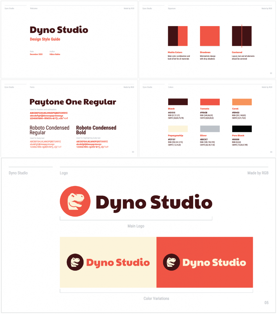
A brand’s color palette often consists of four or five colors that either match or complement the colors in its logo.
The general guideline to select are -:
- For a backdrop, use a light color.
- For the text, choose a brighter color.
- There’s just one neutral color that works with everything.
- One-color that draws attention.
This guideline specifies which fonts are appropriate for your logo and brand in general. If you believe that a script style below your modern and simple logo will be unpleasant to your design moreover, you should express it in your requirements.
This is the first component of your typographic guideline that you must decide on.
Tell the story about why this typeface is the greatest representation of your company.
Will any coloring or effects in the typography around your trademark be permitted?
Setting a minimum size is a remarkably basic point in your usage guideline in addition too digital usage, the minimum size should be in pixels; for print, it should be in inches or millimeters. It’s just as important to set proportionate values as it is to define a minimum size because your logo needs to be consistent in size across letterheads, goods, and digital vs. print applications apart from this, you can use –
Your proportionate value and minimum size guidelines might be as easy as:
- At whatever size, it should be readable and If there isn’t enough room to allow for readability, don’t utilize our complete logo.
- Do not strain or deform the fabric.
Or, to be more specific:
- Your logo must be 16 x 16 pixels at all times.
- Both our wordmark and logomark have a digital minimum size of 20 pixels.
- The minimum size for all of our digital signatures is 35 pixels.
One of the most important logos design concepts is that your logo should appear excellent in black and white, with no enhancements.
What additional colors might you use in your logo?
This is something you should consider while creating your logo usage rules. Here are some logo color considerations to keep in mind:
This is something you should consider while creating your logo usage rules. Here are some logo color considerations to keep in mind:
- Colors of the logo on a white backdrop.
- Colors of the logo against a dark backdrop.
- This is how your black and white logo appears.
- Full color vs. grayscale logo.
- The Colors of the Logo can be reversed.
- To establish clear precedence, your guideline should contain all permitted color variants of your brand.
Having a complete version of your logo, a wordmark, a letter mark, a reduced logo version, icon, and an avatar may be helpful depending on your demands. All of these variants must complement one another and adhere to your logo’s overall design.
font-based logos benefit the company’s wordmark with catchy and memorable names. It’s usually square and has a light visual impact. The simpler form, on the other hand, maybe used on more intricate, visually crowded backdrops.
Moreover, variations of your logo will be included in your logo usage rules, along with suggestions for where they should appear.
Defining what your logo is and isn’t will determine how you should utilize it at all times. Consider how many times someone has mispronounced your name and you had to correct them. Assuming that consumers would “just know” isn’t a winning technique when it comes to creating a strong brand identity.
Moreover, the logo description is a quick explanation of what your logo looks like and why it exists.
CONCLUSION
The most essential element of establishing logo usage guidelines is demonstrating the proper and incorrect methods to use your logo moreover, all of the scenarios in which it should be utilized. Creating guidelines is a creative process that involves a lot of flexibility and potential because setting these standards will ensure that the time and work you put into developing a logo is preserved by ensuring that it always looks beautiful and accurately reflects your business wherever it is used.